Call Today: (704) 931-8801
A few years ago, Google “accidentally” released user-experience playbooks for several industries. These documents tell you the best ways to get more out of your website’s traffic. I think they can help your site bring more value, too.
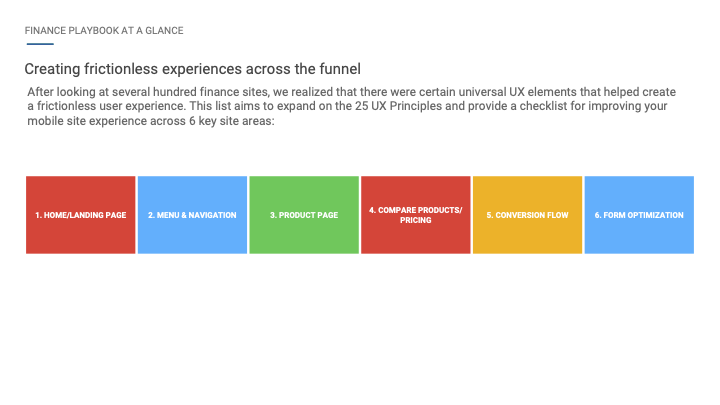
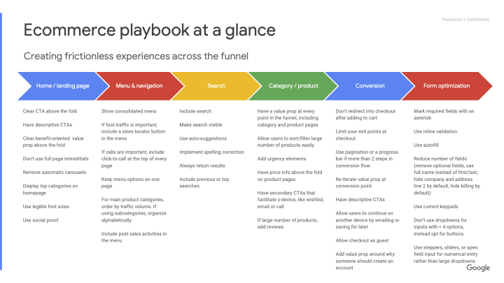
Google knows that user experience (UX) isn’t a one-size-fits-all practice. That’s why they’ve divided their recommendations into several different industries. Here’s the summary slide from some representative decks:
There are also UX decks for other industries (you can get them below), including travel, auto, finance, news (which is relevant to blogs, too), real estate, and healthcare.
I’ve noticed a couple of things among all these decks.
If you peruse the examples Google gives, you’ll quickly notice that all the examples are on mobile sites. None of their examples are from desktop sites. Why? Most website users are from mobile devices!
Unfortunately, most web designers haven’t caught up to this trend yet. Instead, many designers make mobile sites an afterthought. They design the site on their larger-than-average monitors and then break it down for mobile (sometimes after the client has approved the design).
Now that we have a mobile-only index, web design should not be done this way. Instead, designers should think of the mobile website first. Their first design should be how it will look on a phone. From there, they should build it up to the desktop version (even though Google isn’t even looking at your desktop site for “ranking”).
I know that many customers buying websites don’t get this. That’s okay- educate them. Show them how much of their traffic is from mobile devices. Show them how (few?) people convert from the mobile version of their site to show them their missed opportunities. A little look into Google Analytics will help website customers get a better product.
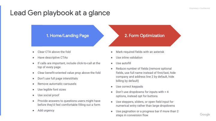
As Google works through the funnel of a customer using a site, the customer always starts on the “Homepage/Landing Page”. While many of you might say, “Duh, David,” don’t miss the nuance! Many web designers assume that all visitors start on the homepage. While this is likely true for most site visitors, Google points out that not all visitors begin on the homepage. Many start on the “Landing Page”. This is especially true if we’re doing an effective search marketing campaign. It’s something web designers often overlook.
So, when designing a website, understand that not everyone will be introduced through your homepage. People landing on an interior page must be introduced to your company and brand. One implication of this: you should include a clear call-to-action on every page of your site (which is also something Google recommends in each of these documents).
Although Google’s UX playbooks are broken out by industry, Google acknowledges that just because something worked for another site, it doesn’t mean it will work for yours too. Each deck contains an important slide:

Don’t just follow Google’s recommendations. Test your changes. Great tools (like HotJar) can help you determine if a user experience change has helped you—or, should I say, helped your website visitors.
I hope you can feel my sarcasm when I say Google “accidentally” released these documents. Google wanted everyone to see them, and this is in Google’s self-interest. Google makes money from its PPC campaigns, but if it can make the traffic from Google Ads more effective, this will help people continue to find value in PPC. Despite the self-interest, I think Google’s recommendations are spot-on.
Want to read these yourself? Here are the complete decks:
UPDATE: Although it’s been several years since Google released these guides, they are still relevant today- maybe even more in an LLM world. Getting traffic to your website from AI systems, like ChatGPT or Google’s AI Mode, is hard. If you can earn that visit, don’t miss out on the opportunity to convert that visitor into a customer. These guides can help!
David Zimmerman has completed the Simmer Technical Marketing Handbook.
Learn why we're reliable.
Read our other credentials.
Reliable Acorn will help you create a custom digital marketing strategy that does just that.
Ready to Talk?